Crafting Atmospheric Dark-Mode Interfaces Without Sacrificing Readability
Learn how to design premium dark-mode websites using tinted obsidian surfaces, layered elevation, restrained accent glow, and high-legibility typography.
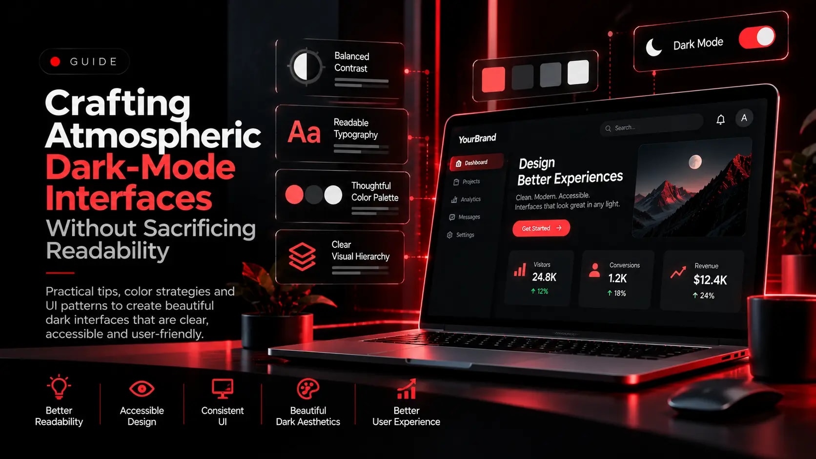
Across fintech, luxury retail, and technology brands, dark-mode interfaces create dramatic focus for product imagery and interactive dashboards. However, poorly executed dark themes often suffer from muddy card boundaries or harsh text glare.
1. Use Tinted Obsidian Surfaces Instead of Flat Pure Black
Pure #000000 backgrounds paired with pure #FFFFFF body copy can cause visual halation on OLED and high-brightness displays. Use deep, subtly tinted charcoal or obsidian surfaces and slightly softened off-white body text for comfortable long-form reading.
2. Communicate Elevation With Subtle Borders and Specular Edges
Drop shadows alone are less visible on dark backgrounds. Define interactive cards using progressively lighter surface tokens, translucent 1px borders, and subtle top-edge highlights.
3. Reserve High-Saturation Accent Colours for Primary Actions
Keep primary accent colours focused on calls to action, active navigation indicators, and key metrics so the visitor’s eye is guided naturally down the page.
Explore Related Capabilities & Work
Intime Webs Services
Work With Intime Webs
Want a distinctive, high-craft visual identity?
Intime Webs crafts custom dark and light interface systems with balanced contrast, depth, and readability.
Continue Reading · Related Insights
View All 20 Articles →
Designing With Motion Without Hurting Usability
Animation can make a website feel responsive, polished, and memorable. Learn how to use motion deliberately while protecting performance, accessibility, and mobile usability.

Designing E-Commerce Catalogues & Checkouts That Reduce Drop-Off
Shoppers abandon stores when product specifications are unclear or checkout feels complicated. Learn how structured merchandising and frictionless checkout design support online retail.
Accessible by Default: Engineering Websites for Keyboard, Contrast & Screen Readers
Accessibility is not a post-launch checklist item. Learn how semantic landmarks, keyboard navigation, colour contrast, and clear form labels improve UX for every visitor.