Designing With Motion Without Hurting Usability
Learn how to design smooth website animations that improve interaction while protecting performance, accessibility, mobile usability, and user experience.
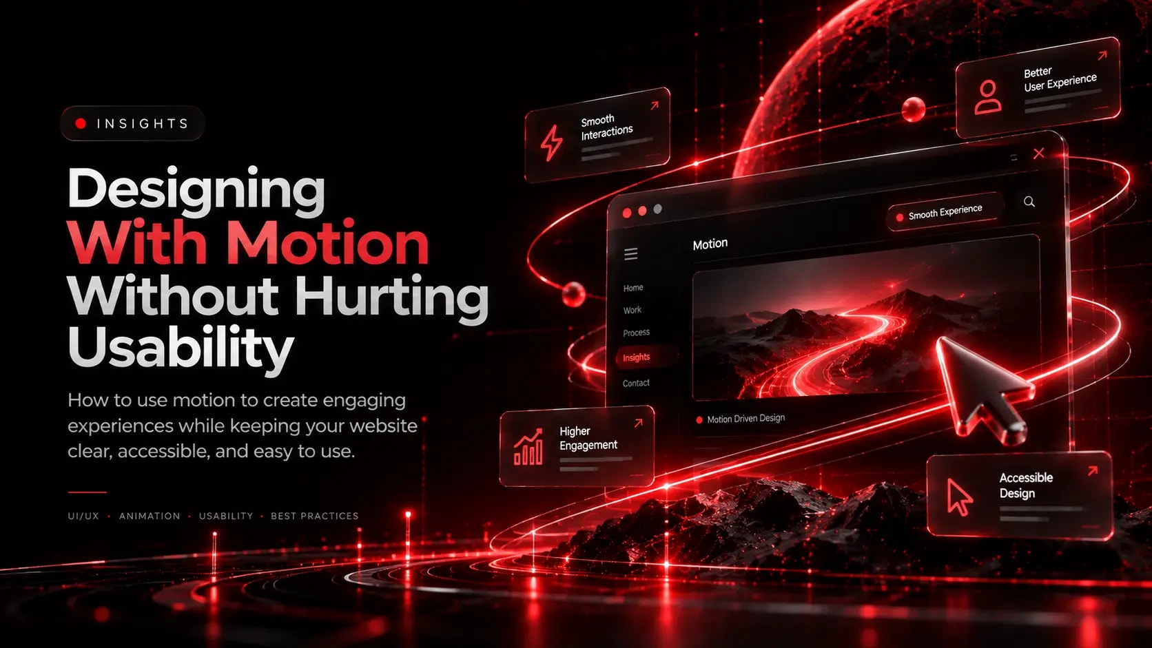
Animation can make a website feel responsive, polished, and memorable. Subtle transitions can explain how an interface works, draw attention to important changes, and create a stronger visual identity.
However, motion should support the user—not compete with the content.
1. Give Every Animation a Purpose
Before adding an effect, ask what it communicates.
A button transition can confirm that an interaction has occurred. A navigation animation can help users understand a change of context. A restrained scroll reveal can introduce a section without overwhelming the page.
If an animation adds no meaningful feedback or understanding, consider removing it.
2. Prioritise Performance
Heavy animations can affect responsiveness, especially on mobile devices or lower-powered hardware.
Where practical, prefer animations based on CSS properties such as transform and opacity. Avoid repeatedly triggering expensive layout calculations, and profile complex effects with browser developer tools.
For scroll-driven experiences, avoid tying essential content visibility to a fragile animation sequence. Content should remain accessible if an animation fails or JavaScript is unavailable.
3. Respect Reduced-Motion Preferences
Some users experience dizziness, discomfort, or other difficulties with animated interfaces.
Use the prefers-reduced-motion media query to provide a less animated experience when a visitor's operating system indicates that preference. Remove or simplify non-essential movement while preserving the information and functionality.
Avoid unnecessary flashing, excessive parallax, and continuous movement that distracts from reading.
4. Keep Interactions Predictable
Buttons, menus, tabs, forms, and other interactive components should behave consistently. Animation must not delay essential actions or make users uncertain about what is clickable.
Provide clear hover, focus, active, and error states. Make interactive elements usable with a keyboard and preserve visible focus indicators.
5. Design for Mobile and Touch
An effect that feels smooth with a mouse may behave differently on a touch device. Test scrolling, swipe gestures, sticky elements, and animated navigation on real devices or representative emulators.
Avoid hover-only interactions and ensure essential content does not depend on a mouse pointer.
6. Measure the Experience
Check whether animations introduce layout shifts, block the main thread, or delay interactions. Review Core Web Vitals and use performance profiling to identify problems.
Also test the interface without animation and with reduced motion enabled. The page should still make sense.
Final Thoughts
Great motion design is not about animating everything. It is about using movement deliberately to communicate, guide, and reassure.
When animation is purposeful, accessible, and performant, it can enhance the experience without sacrificing usability.
Explore Related Capabilities & Work
Intime Webs Services
Work With Intime Webs
Want a website with purposeful animation?
Intime Webs creates modern digital experiences where motion, visual design, and usability work together.
Continue Reading · Related Insights
View All 20 Articles →
Designing E-Commerce Catalogues & Checkouts That Reduce Drop-Off
Shoppers abandon stores when product specifications are unclear or checkout feels complicated. Learn how structured merchandising and frictionless checkout design support online retail.
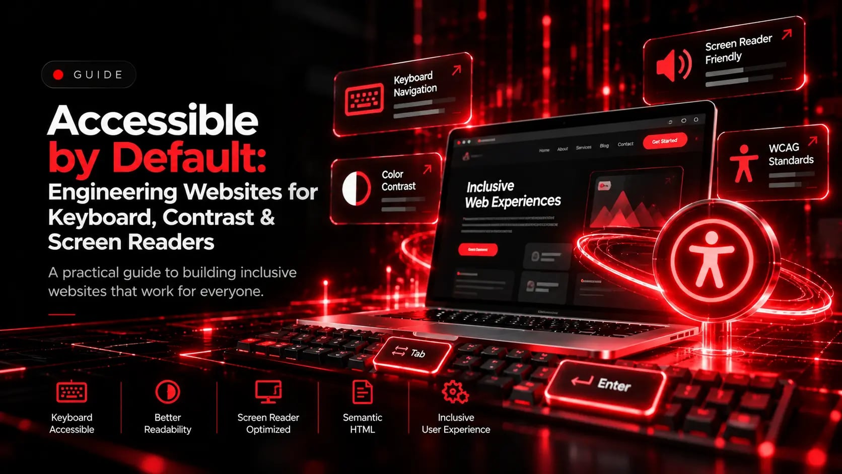
Accessible by Default: Engineering Websites for Keyboard, Contrast & Screen Readers
Accessibility is not a post-launch checklist item. Learn how semantic landmarks, keyboard navigation, colour contrast, and clear form labels improve UX for every visitor.
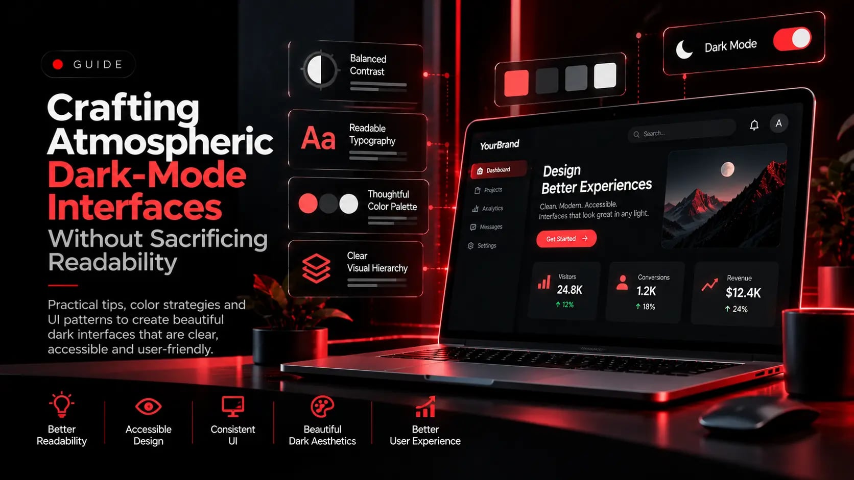
Crafting Atmospheric Dark-Mode Interfaces Without Sacrificing Readability
Dark interfaces project authority and modern craft, but flat pure-black backgrounds and neon text cause eye strain. Here is how to engineer balanced dark-mode UI systems.