Designing E-Commerce Catalogues & Checkouts That Reduce Drop-Off
Learn how clear product hierarchy, filtering, transparent shipping information, and streamlined checkout steps improve online store usability.

Whether you sell luxury jewellery directly to consumers or technical equipment to B2B buyers, an online store succeeds when visitors can find the right item quickly, verify its details, and complete their purchase or enquiry without friction.
1. Prioritise Visual Clarity in Product Cards
Product cards are the building blocks of catalogue discovery. Display crisp product photography, clear pricing, essential variant or capacity indicators, and honest promotional labels without cluttering the viewport.
2. Make Filtering and Category Navigation Effortless
Allow shoppers to filter by meaningful attributes—such as collection, price range, material, or technical capacity—and ensure filters work smoothly on mobile screens without full-page reloads.
3. Streamline the Mobile Checkout Journey
- Support guest checkout so first-time buyers are never forced to register before paying.
- Show shipping costs, taxes, and delivery timelines early in the cart.
- Use appropriate mobile input types (tel, email, numeric) and browser autofill attributes.
- Keep payment gateway steps clear, secure, and visually reassuring.
4. Support Search Discovery With Product Structured Data
Mark up product pages with accurate Product and Offer schema—including price, currency, and availability—so search engines can understand your catalogue accurately.
Explore Related Capabilities & Work
Intime Webs Services
Portfolio Showcases
Work With Intime Webs
Planning a new online store or WooCommerce rebuild?
Intime Webs designs and engineers e-commerce storefronts built around product clarity and mobile shopping ease.
Continue Reading · Related Insights
View All 20 Articles →
Designing With Motion Without Hurting Usability
Animation can make a website feel responsive, polished, and memorable. Learn how to use motion deliberately while protecting performance, accessibility, and mobile usability.

Accessible by Default: Engineering Websites for Keyboard, Contrast & Screen Readers
Accessibility is not a post-launch checklist item. Learn how semantic landmarks, keyboard navigation, colour contrast, and clear form labels improve UX for every visitor.
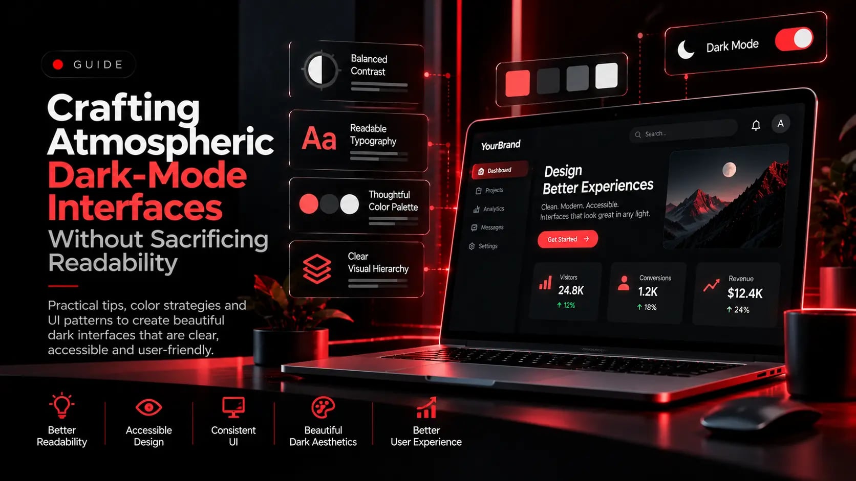
Crafting Atmospheric Dark-Mode Interfaces Without Sacrificing Readability
Dark interfaces project authority and modern craft, but flat pure-black backgrounds and neon text cause eye strain. Here is how to engineer balanced dark-mode UI systems.