Accessible by Default: Engineering Websites for Keyboard, Contrast & Screen Readers
Learn how semantic HTML, keyboard navigation, visible focus states, colour contrast, and ARIA discipline make websites usable for everyone.
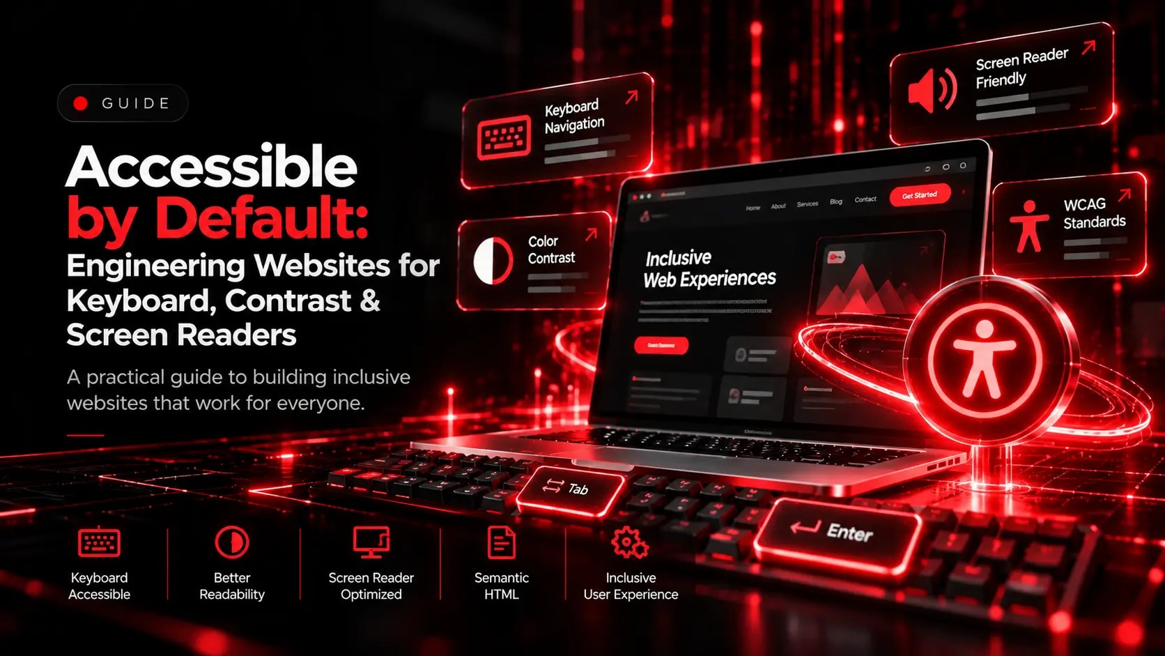
When accessibility is treated as an afterthought, interfaces end up with low-contrast text, custom dropdowns that cannot be operated with a keyboard, and icon buttons with no accessible names.
1. Use Native Semantic HTML Elements First
Use real <button>, <a>, <nav>, <main>, <header>, and <label> elements rather than generic <div> tags. Native elements provide built-in keyboard handling and screen-reader announcements automatically.
2. Maintain Strong Colour Contrast in Dark and Light Themes
- Aim for at least a 4.5:1 contrast ratio for body text and 3:1 for large display headings and interactive boundaries.
- Never rely on colour alone to communicate form errors or status changes—pair colour with clear text or icons.
3. Preserve Visible Keyboard Focus Indicators
Every interactive link, tab, modal, and form control must be reachable via the Tab key with a clear, high-visibility focus ring.
Explore Related Capabilities & Work
Intime Webs Services
Work With Intime Webs
Want an accessible, standards-compliant website?
Intime Webs builds accessibility into every design system, component, and user journey from day one.
Continue Reading · Related Insights
View All 20 Articles →
Designing With Motion Without Hurting Usability
Animation can make a website feel responsive, polished, and memorable. Learn how to use motion deliberately while protecting performance, accessibility, and mobile usability.

Designing E-Commerce Catalogues & Checkouts That Reduce Drop-Off
Shoppers abandon stores when product specifications are unclear or checkout feels complicated. Learn how structured merchandising and frictionless checkout design support online retail.
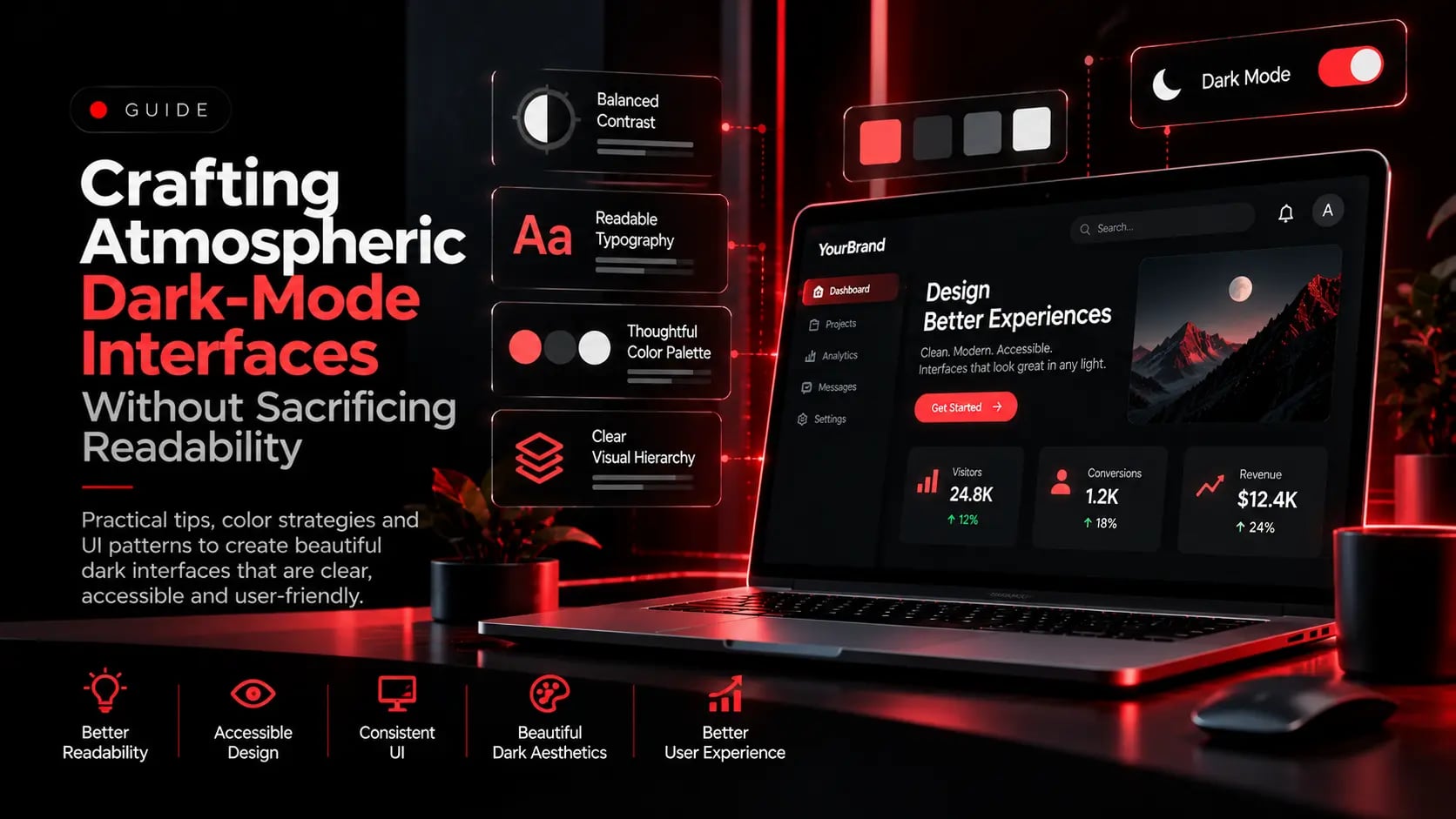
Crafting Atmospheric Dark-Mode Interfaces Without Sacrificing Readability
Dark interfaces project authority and modern craft, but flat pure-black backgrounds and neon text cause eye strain. Here is how to engineer balanced dark-mode UI systems.