Why Growing Brands Need a Reusable Web Design System
Learn how design tokens, reusable React/Next.js UI components, and documented typography scales speed up page launches and maintain brand consistency.
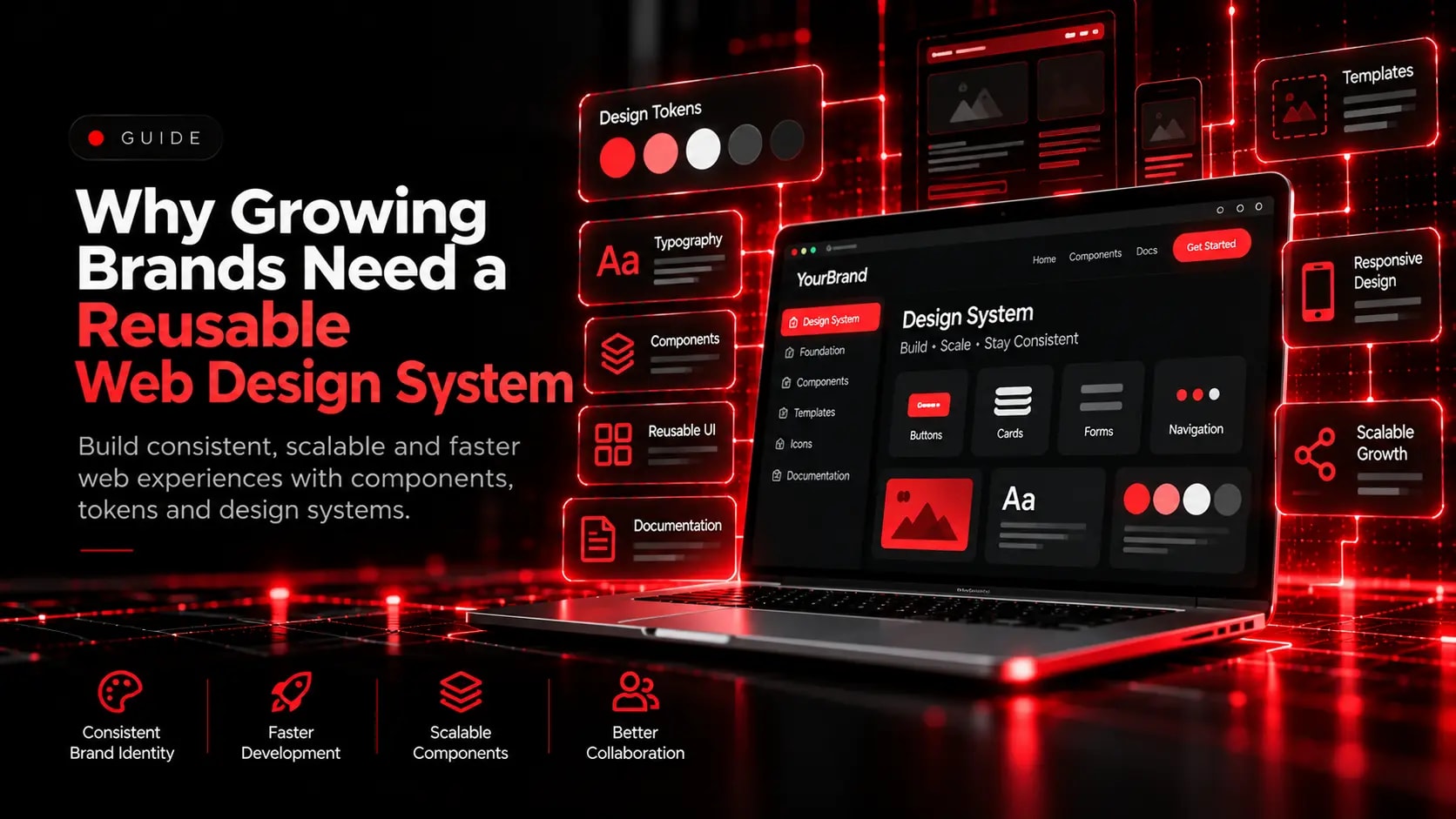
As a website grows from five pages to fifty, ad-hoc styling leads to mismatched buttons, inconsistent spacing, and bloated CSS. A structured design system solves this by defining shared foundations once and reusing them everywhere.
1. Establish Semantic Tokens for Colour, Typography, and Spacing
Define fluid typographic scales (using CSS clamp), consistent spacing increments, and semantic colour variables (background, surface, border, primary accent, muted text) so design and code speak the exact same language.
2. Build Composable UI Primitives
- Standardise buttons, form inputs, cards, badges, and section headers with predictable props and states.
- Bake keyboard accessibility, hover transitions, and responsive behaviour into the base components.
- Allow marketing and product teams to assemble new campaign pages rapidly without reinventing layouts.
Explore Related Capabilities & Work
Intime Webs Services
Work With Intime Webs
Ready to unify your digital brand and component library?
Intime Webs designs and engineers reusable component systems in Figma, React, Next.js, and Tailwind CSS.
Continue Reading · Related Insights
View All 20 Articles →
Designing With Motion Without Hurting Usability
Animation can make a website feel responsive, polished, and memorable. Learn how to use motion deliberately while protecting performance, accessibility, and mobile usability.
Designing E-Commerce Catalogues & Checkouts That Reduce Drop-Off
Shoppers abandon stores when product specifications are unclear or checkout feels complicated. Learn how structured merchandising and frictionless checkout design support online retail.
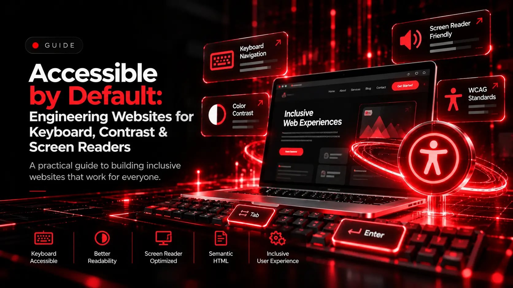
Accessible by Default: Engineering Websites for Keyboard, Contrast & Screen Readers
Accessibility is not a post-launch checklist item. Learn how semantic landmarks, keyboard navigation, colour contrast, and clear form labels improve UX for every visitor.